“The data is not offered on a platter by the Kerala government. Automation of the daily bulletin is impossible. We have to sit down with a pen and paper to figure it out,” explains Nikhil N, one of the volunteers of the team behind the covid19kerala.info, a dashboard for all data related to the COVID-19 cases in the state.
The website, which is a clone of covid19japan.com dashboard, is not government-run but is maintained by a team of about 19 academics, data enthusiasts and coders. These volunteers, who are part of the CODD-K (Collective for Open Data Distribution - Kerala) team, validate the data (to check for its accuracy and source) sitting in different parts of the world, including Japan, South Korea, Poland, the US, the Middle East and India.
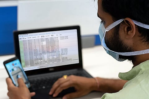
This dashboard offers simple and comprehensive statistics on the number of COVID-19 cases in Kerala (confirmed, active, recovered and tested cases) and district-wise data on the outbreak in the form of percentages, interactive maps and coloured graphs.
The daily bulletins put out by the Directorate of Health Service (DHS) of the Kerala government show the chronology of the cases reported, the number of cases in each district and represent the patients under treatment and discharged as mere figures.

The covid19kerala dashboard features a detailed live patient database, comprising the age, gender and city/district of residence of the patient, detected district, if it is an imported case or contact transmission, the known cluster and discharge date, among other relevant information.
There are two factors that make updating and maintaining these comprehensive figures daily a Herculean task for the team.
The team depends on the Union Ministry of Health and Family Welfare and the DHS for the primary source of data. This is, however, only the preliminary groundwork.
“The Kerala government does not release the age, gender and disease transmission details of the patients. We read the district editions of the newspapers every day and capture the missing data. So, 50% is guesswork and the rest, we depend on media reports,” explains Jijo Ulahannan, one of the earliest members of the team.
The Karnataka government provides these statistics, the team points out. For example, it tells if patient 140 got infected by patient 121. The covid19japan site, too, has an extensive system, which includes the patient identification number, hospital id, district id and other real-time updates.
The second factor that makes updating the site a time-consuming process is the manual entry of data. “The government bulletin is not consistent. if the columns and rows change, the entire data will show an error,” Jijo explains.
Since the outbreak snowballed into a pandemic, there has been an urgent need to broaden the contract tracing exercise. That means, publishing the details of the patients so that others can be cautious and quarantine themselves if they may have had contact with a patient. However, this leads to the debate of privacy breach during the public health crisis.
“But we are not seeking personal information. We are not talking about using the data. We want to deduce or understand the data,” says Nikhil.
He points out that such data can help in research, to understand the COVID-19 effects on certain age groups, the fatality rates, if it affects more children and senior citizens, men or women, the number of days a young person spends in the hospital for treatment.
“Besides, we are trying to collate a cluster map. But we cannot simply do a Kasaragod cluster map with whatever is available currently. We have to know the actual locality; for instance, if Patient A came from Sharjah, and if Patient B is Patient A’s son, daughter or wife,” reasons Nikhil.
“Even to do the forecasting with this data, the initial step has been made difficult. We have to read all newspapers and join the dots between each patient,” he adds. “For instance, in Pathanamthitta, a patient who got admitted on March 10 is still in the hospital, while others in that cluster were discharged. We had to go back to the newspaper on March 11 to figure it out,” he says.
The genesis of this dashboard can be traced back to the 2018 floods in Kerala. “During the floods, we were a part of a volunteering group of people with varied expertise. This group stuck on. When the pandemic started, some moved on to helping with technical aspects, like ventilators. A few others decided to start this repository of data,” recalls Jijo.
It was Japan-based Nishad Thalhath who first suggested the idea. He gave the coding support for the COVID-19 dashboard. “In Japan, during a calamity, every process is recorded. Metadata is then created, which, in turn, will be used for future purposes. This will give well-defined roles and useful information to the government, public stakeholders and NGOs on disaster management,” says Jijo.
While it did not work out during the floods, it finally materialised during this pandemic. They have been individually tracking the developments since early February when there were only a few cases. “On March 8, when the cases started surging in Kerala, the idea came up once again. On March 20, we decided to clone the Japan dashboard using Google Sheets, an important tool for data visualisation,” says Jijo, who brought the team together this time.
Two days later, the site was up. “We keep adding data to the backbone database. Since it has been over 14 days since the site was launched, the team can identify those discharged and can validate the data better,” he says.
“Of course, our main interest behind this dashboard was to create awarness and for an academic purpose; for predictions, data fitting, how to present these data to the world, cluster mapping,” adds Jijo.
Academics and data experts say that the situation is cautiously optimistic for Kerala, as the active cases have been steady and the number of recoveries has been slowly rising. Cautious optimism refers to the feeling of confidence about a situation and its outcomes while being prepared to face any failures and challenges.
The team has been doing predictive analysis simultaneously by running some models. “Based on the SIR Model (susceptible, infected and recovered individuals), Kerala will be stable till April 10 and 14, as the state borders have been closed and suspected cases have been identified. If the lockdown is lifted and people start moving around, it may go up.
Meanwhile, India has not reached the inflection point (a point where the curvature starts changing). “Maybe by this month-end, it will reach there as the cases are growing in some states,” says Jijo.